⚠️ Warning: This Book might contain APIs from the latest git version that might not be available on the stable versions released on crates.io. As a general rule, don't expect everything to be documented here.
Welcome
Freya is a work in progress cross-platform native GUI library for 🦀 Rust, built on top of 🧬 Dioxus and 🎨 Skia as graphics library.
Check out the examples in the Freya repository to learn more.
What is Freya?
Freya is native GUI library for Rust🦀, built on top of 🧬 Dioxus's core and powered by 🎨 Skia as a graphics library.
Features
- ⛏️ Built-in components (button, scroll views, switch and more)
- 🚇 Built-in hooks library (animations, text editing and more)
- 🔍 Built-in devtools panel (experimental ⚠️)
- 🧰 Built-in headless testing runner for components
- 🎨 Theming support (not extensible yet ⚠️)
- 🛩️ Cross-platform (Windows, Linux, MacOS)
- 🖼️ SKSL Shaders support
- 🔄️ Dioxus Hot-reload support
- 📒 Multi-line text editing (experimental ⚠️)
- 🦾 Basic Accessibility Support (experimental ⚠️)
- 🧩Compatible with dioxus-sdk and other Dioxus renderer-agnostic libraries
Why 🧬 Dioxus?
Dioxus is a React-like library for Rust. Its component and hooks model make it simple to use and scale to complex apps. Freya uses some of Dioxus core crates to build it's own renderer, this is because Dioxus is to it's core a renderer-agnostic UI library. See other differences with Freya.
Why 🎨 Skia?
Skia is a battle-tested and well-maintained graphics library, and there are even some rusty bindings.
Differences with Dioxus
Freya uses most of the core packages of Dioxus, but not all them.
These are the main differences between Freya and the official Dioxus renderers for Desktop (webview and Blitz):
| Category | Freya | Dioxus Renderers |
|---|---|---|
| Elements, attributes and events | Custom | HTML |
| Layout | Torin | WebView and Taffy |
| Renderer | Skia | WebView or WGPU |
| Components library | Custom | None, but can use CSS libraries |
| Devtools | Custom | Provided in Webview |
| Headless testing runner | Custom | None |
Environment Setup
Make sure you have Rust and your OS dependencies installed.
Windows
You will need C++ build tools which you can get through Visual Studio 2022, learn more here.
Linux
Debian-based (Ubuntu, PopOS, etc)
Install these packages:
sudo apt install build-essential libssl-dev pkg-config cmake libgtk-3-dev libclang-dev
Arch Linux
Install these packages:
sudo pacman -S base-devel openssl cmake gtk3 clang
Don't hesitate to contribute so other distros can be added here.
MacOS
No setup required. But feel free to add more if we miss something.
Getting started
I encourage you to learn how Dioxus works, when you are done you can continue here. Also make sure you have the followed the environment setup guide.
Now, let's start by creating a hello world project.
Creating the project
mkdir freya-app
cd freya-app
cargo init
Cargo.toml
Make sure to add Freya and Dioxus as dependencies:
[package]
name = "freya-app"
version = "0.1.0"
edition = "2021"

[dependencies]
freya = "0.1"
dioxus = { version = "0.4", features = ["macro", "hooks"], default-features = false }
src/main.rs
And paste this code in your main.rs file.
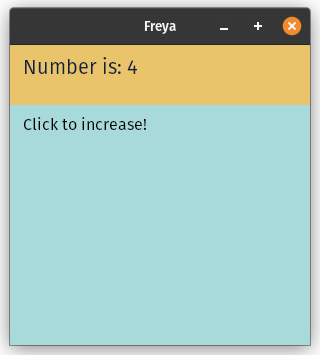
#![cfg_attr(
    all(not(debug_assertions), target_os = "windows"),
    windows_subsystem = "windows"
)]

use freya::prelude::*;

fn main() {
    launch(app);
}

fn app(cx: Scope) -> Element {
    let mut count = use_state(cx, || 0);

    render!(
        rect {
            height: "100%",
            width: "100%",
            background: "rgb(35, 35, 35)",
            color: "white",
            padding: "12",
            onclick: move |_| count += 1,
            label { "Click to increase -> {count}" }
        }
    )
}
Running
Simply run with cargo:
cargo run
Nice! You have created your first Freya app.
You can learn more with the examples in the repository.
Frequently Asked Questions
Will Freya have Mobile/Web support?
Freya current focus is on Desktop (Windows, Linux, MacOS), so there is no plans for either Mobile (Android/iOS) or Web support. But, this doesn't mean it won't happen in the future, who knows! From a technical point of view, it is possible to run Freya on these platforms with the right adjustements.
Why Skia instead of Webview?
These are the main reasons for this:
- Ability to define the elements, attributes, styling, layout and events to my own criteria
- Apps UI look the same no matter the platform
- Because Freya has control over all the the pipeline it is easier to implement and use certain features such as headless testing runner
- Not relying on OS for new features or fixes
Elements
Freya contains a set of primitive elements:
rect
The rect element (aka rectangle) is a box where you can place as many elements inside you want.
You can specify things like width, paddings or even in what direction the inner elements are stacked.
Example:
#![allow(unused)]
fn main() {
fn app(cx: Scope) -> Element {
    render!(
        rect {
            direction: "vertical",
            label { "Hi!" }
            label { "Hi again!"}
        }
    )
}
}
label
The label element simply shows some text.
Example:
#![allow(unused)]
fn main() {
fn app(cx: Scope) -> Element {
    render!(
        label {
            "Hello World"
        }
    )
}
}
svg
The svg element let's you draw a SVG. You will need to use the bytes_to_data to transform the bytes into data the element can recognize.
Example:
#![allow(unused)]

fn main() {
static FERRIS: &[u8] = include_bytes!("./ferris.svg");

fn app(cx: Scope) -> Element {
    let ferris = bytes_to_data(cx, FERRIS);
    render!(
        svg {
            svg_data: ferris,
        }
    )
}
}
image
The image element, just like svg element, require you to pass the image bytes yourself.
#![allow(unused)]
fn main() {
static RUST_LOGO: &[u8] = include_bytes!("./rust_logo.png");

fn app(cx: Scope) -> Element {
    let image_data = bytes_to_data(cx, RUST_LOGO);
    render!(
        image {
            image_data: image_data,
            width: "{size}",
            height: "{size}",
        }
    )
}
}
paragraph and text
Both paragraph and text elements are used together. They will let you build texts with different styles.
#![allow(unused)]
fn main() {
fn app(cx: Scope) -> Element {
    render!(
        paragraph {
            text {
                font_size: "15",
                "Hello, "
            }
            text {
                font_size: "30",
                "World!"
            }
        }
    )
}
}
Layout
Learn how the layout attributes work.
width & heightmin_width & min_heightmax_width & max_heightSize unitsdirectionpaddingmargindisplay
⚠️ Freya's layout is still somewhat limited.
width & height
All elements support both width and height attributes.
See syntax for Size Units.
Usage
#![allow(unused)]
fn main() {
fn app(cx: Scope) -> Element {
    render!(
        rect {
            background: "red",
            width: "15",
            height: "50",
        }
    )
}
}
min_width & min_height
rect supports specifying a minimum width and height, this can be useful if you use it alongside a percentage for the target size.
See syntax for Size Units.
Usage
#![allow(unused)]
fn main() {
fn app(cx: Scope) -> Element {
    render!(
        rect {
            background: "red",
            min_width: "100",
            min_height: "100",
            width: "50%",
            height: "50%",
        }
    )
}
}
max_width & max_height
rect supports specifying a maximum width and height.
See syntax for Size Units.
Usage
#![allow(unused)]
fn main() {
fn app(cx: Scope) -> Element {
    render!(
        rect {
            background: "red",
            max_width: "50%",
            max_height: "50%",
            width: "500",
            height: "500",
        }
    )
}
}
Size Units
Auto
Will use it's inner children as size, so in this case, the rect width will be equivalent to the width of label:
#![allow(unused)]
fn main() {
fn app(cx: Scope) -> Element {
    render!(
        rect {
            width: "auto",
            height: "33",
            label {
                "hello!"
            }
        }
    )
}
}
Logical pixels
#![allow(unused)]
fn main() {
fn app(cx: Scope) -> Element {
    render!(
        rect {
            width: "50",
            height: "33"
        }
    )
}
}
Percentages
Relative percentage to the parent equivalent value.
#![allow(unused)]
fn main() {
fn app(cx: Scope) -> Element {
    render!(
        rect {
            width: "50%", // Half the parent
            height: "75%" // 3/4 the parent
        }
    )
}
}
calc()
For more complex logic you can use the calc() function.
#![allow(unused)]
fn main() {
fn app(cx: Scope) -> Element {
    render!(
        rect {
            width: "calc(33% - 60 + 15%)", // (1/3 of the parent minus 60) plus 15% of parent
            height: "calc(100% - 10)" // 100% of the parent minus 10
        }
    )
}
}
direction
Control how the inner elements will be stacked, possible values are horizontal, vertical (default) or both (default for text elements, e.g label, paragraph, text, etc).
Usage
#![allow(unused)]
fn main() {
fn app(cx: Scope) -> Element {
    render!(
        rect {
            width: "100%",
            height: "100%",
            direction: "vertical",
            rect {
                width: "100%",
                height: "50%",
                background: "red"
            },
            rect {
                width: "100%",
                height: "50%",
                background: "green"
            }
        }
    )
}
}
padding
Specify the inner paddings of an element. You can do so by three different ways.
#![allow(unused)]
fn main() {
fn app(cx: Scope) -> Element {
    render!(
        rect {
            padding: "25" // 25 in all sides
            padding: "100 50" // 100 in top and bottom, and 50 in left and right
            padding: "5 7 3 9" // 5 in top, 7 in right, 3 in bottom and 9 in left
        }
    )
}

}
display
Control how the inner elements are displayed, possible values are normal (default) or center.
#![allow(unused)]
fn main() {
fn app(cx: Scope) -> Element {
    render!(
        rect {
            width: "100%",
            height: "100%",
            direction: "both",
            display: "center",
            rect {
                width: "50%",
                height: "50%",
                background: "red"
            },
        }
    )
}
}
margin
Specify the margin of an element. You can do so by three different ways.
#![allow(unused)]
fn main() {
fn app(cx: Scope) -> Element {
    render!(
        rect {
            margin: "25" // 25 in all sides
            margin: "100 50" // 100 in top and bottom, and 50 in left and right
            margin: "5 7 3 9" // 5 in top, 7 in right, 3 in bottom and 9 in left
        }
    )
}
}
Style
Learn how the style attributes work.
background
The background attribute will let you specify a color as the background of the element.
You can learn about the syntax of this attribute here.
Example:
#![allow(unused)]
fn main() {
fn app(cx: Scope) -> Element {
    render!(
        rect {
            background: "red"
        }
    )
}
}
Compatible elements: rect
shadow
The shadow attribute let's you draw a shadow outside of the element.
Syntax: <x> <y> <intensity> <size> <color>
Example:
#![allow(unused)]
fn main() {
fn app(cx: Scope) -> Element {
    render!(
        rect {
            shadow: "0 0 25 2 rgb(0, 0, 0, 120)"
        }
    )
}
}
Compatible elements: rect
corner_radius & corner_smoothing
The corner_radius attribute let's you smooth the corners of the element, with corner_smoothing you can archieve a "squircle" effect.
Example:
#![allow(unused)]
fn main() {
fn app(cx: Scope) -> Element {
    render!(
        rect {
            corner_radius: "10",
            corner_smoothing: "75%"
        }
    )
}
}
Compatible elements: rect
border
You can add a border to an element using the border and border_align attributes.
bordersyntax:[width] <solid | none> [color].border_alignsyntax:<inner | outer | center>.
Example:
#![allow(unused)]
fn main() {
fn app(cx: Scope) -> Element {
    render!(
        rect {
            border: "2 solid black",
            border_align: "inner"
        }
    )
}
}
Compatible elements: rect
overflow
Specify how overflow should be handled.
Accepted values: clip | none.
Example:
#![allow(unused)]
fn main() {
fn app(cx: Scope) -> Element {
    render!(
        rect {
            overflow: "clip"
            width: "100",
            height: "100%",
            rect {
                width: "500",
                height: "100%",
                background: "red",
            }
        }
    )
}
}
Compatible elements: rect
Color syntax
The attributes that have colors as values can use the following syntax:
Static colors
redbluegreenyellowblack(default forcolorattribute)graywhite(default forbackgroundattribute)orangetransparent
rgb() / hsl()
- With RGB:
rgb(150, 60, 20) - With RGB and alpha:
rgb(150, 60, 20, 70) - With HSL:
hsl(28deg, 80%, 50%) - With HSL and alpha:
hsl(28deg, 80%, 50%, 25%)
Inheritance
These are some attribute that are inherited from the element parents:
colorfont_familyfont_sizefont_stylefont_weightfont_widthline_heightalignmax_linesletter_spacingword_spacingdecorationdecoration_styledecoration_colortext_shadow
Font Style
Learn how the font style attributes work.
colorfont_familyfont_sizealignfont_stylefont_weightfont_widthline_heightmax_linesletter_spacingword_spacingdecorationdecoration_styledecoration_colortext_shadowtext_overflow
color
The color attribute let's you specify the color of the text.
You can learn about the syntax of this attribute in Color Syntax.
Example:
#![allow(unused)]
fn main() {
fn app(cx: Scope) -> Element {
    render!(
        label {
            color: "green",
            "Hello, World!"
        }
    )
}
}
Another example showing inheritance:
#![allow(unused)]
fn main() {
fn app(cx: Scope) -> Element {
    render!(
        rect {
            color: "blue",
            label {
                "Hello, World!"
            }
        }
    )
}

}
Compatible elements: label, paragraph, text
font_family
With the font_family you can specify what font do you want to use for the inner text.
Example:
#![allow(unused)]
fn main() {
fn app(cx: Scope) -> Element {
    render!(
        label {
            font_family: "Inter",
            "Hello, World!"
        }
    )
}
}
You can also specify multiple fonts in order of priority, if one is not found it will fallback to the next one.
Example:
#![allow(unused)]
fn main() {
fn app(cx: Scope) -> Element {
    render!(
        label {
            font_family: "DoesntExist Font, Impact",
            "Hello, World!"
        }
    )
}
}
Compatible elements: label, paragraph,
font_size
You can specify the size of the text using font_size.
Example:
#![allow(unused)]
fn main() {
fn app(cx: Scope) -> Element {
    render!(
        label {
            font_size: "50",
            "Hellooooo!"
        }
    )
}
}
Compatible elements: label, paragraph, text
align
You can change the alignment of the text using the align attribute.
Accepted values: center, end, justify, left, right, start
Example
#![allow(unused)]
fn main() {
fn app(cx: Scope) -> Element {
    render!(
        label {
            align: "right",
            "Hello, World!"
        }
    )
}
}
Compatible elements: label, paragraph,
font_style
You can choose a style for a text using the font_style attribute.
Accepted values: upright (default), italic and oblique.
Example:
#![allow(unused)]
fn main() {
fn app(cx: Scope) -> Element {
    render!(
        label {
            font_style: "italic",
            "Hello, World!"
        }
    )
}
}
Compatible elements: text, label.
font_weight
You can choose a weight for a text using the font_weight attribute.
Accepted values:
invisiblethinextra-lightlightnormal(default)mediumsemi-boldboldextra-boldblackextra-black50100200300400500600700800900950
Example:
#![allow(unused)]
fn main() {
fn app(cx: Scope) -> Element {
    render!(
        label {
            font_weight: "bold",
            "Hello, World!"
        }
    )
}
}
Compatible elements: text, label.
font_width
You can choose a width for a text using the font_width attribute.
Accepted values:
ultra-condensedextra-condensedcondensednormal(default)semi-expandedexpandedextra-expandedultra-expanded
Example:
#![allow(unused)]
fn main() {
fn app(cx: Scope) -> Element {
    render!(
        label {
            font_weight: "bold",
            "Hello, World!"
        }
    )
}
}
Compatible elements: text, label.
line_height
Specify the height of the lines of the text.
Example:
#![allow(unused)]
fn main() {
fn app(cx: Scope) -> Element {
    render!(
        label {
            lines_height: "3",
            "Hello, World! \n Hello, again!"
        }
    )
}
}
max_lines
Determines the amount of lines that the text can have. It has unlimited lines by default.
Example:
#![allow(unused)]
fn main() {
fn app(cx: Scope) -> Element {
    render!(
        label {
            "Hello, World! \n Hello, World! \n Hello, world!" // Will show all three lines
        }
        label {
            max_lines: "2",
            "Hello, World! \n Hello, World! \n Hello, world!" // Will only show two lines
        }
    )
}
}
Compatible elements: text, paragraph.
letter_spacing
Specify the spacing between characters of the text.
Example:
#![allow(unused)]
fn main() {
fn app(cx: Scope) -> Element {
    render!(
        label {
            letter_spacing: "10",
            "Hello, World!"
        }
    )
}
}
Compatible elements: text, paragraph, label.
word_spacing
Specify the spacing between words of the text.
Example:
#![allow(unused)]
fn main() {
fn app(cx: Scope) -> Element {
    render!(
        label {
            word_spacing: "10",
            "Hello, World!"
        }
    )
}
}
Compatible elements: text, paragraph, label.
decoration
Specify the decoration in a text.
Accpted values:
underlineline-throughoverline
Example:
#![allow(unused)]
fn main() {
fn app(cx: Scope) -> Element {
    render!(
        label {
            decoration: "line-through",
            "Hello, World!"
        }
    )
}
}
Compatible elements: text, paragraph, label.
decoration_style
Specify the decoration's style in a text.
Accpted values:
solid(default)doubledotteddashedwavy
Example:
#![allow(unused)]
fn main() {
fn app(cx: Scope) -> Element {
    render!(
        label {
            decoration: "line-through",
            decoration_style: "dotted",
            "Hello, World!"
        }
    )
}
}
Compatible elements: text, paragraph, label.
decoration_color
Specify the decoration's color in a text.
You can learn about the syntax of this attribute in Color Syntax.
Example:
#![allow(unused)]
fn main() {
fn app(cx: Scope) -> Element {
    render!(
        label {
            decoration: "line-through",
            decoration_color: "orange",
            "Hello, World!"
        }
    )
}
}
Compatible elements: text, paragraph, label.
text_shadow
Specify the shadow of a text.
Syntax: <x> <y> <size> <color>
Example:
#![allow(unused)]
fn main() {
fn app(cx: Scope) -> Element {
    render!(
        label {
            text_shadow: "0 18 12 rgb(0, 0, 0)",
            "Hello, World!"
        }
    )
}
}
Compatible elements: text, label.
text_overflow
Determines how text is treated when it exceeds its max_lines count. By default uses the clip mode, which will cut off any overflowing text, with ellipsis mode it will show ... at the end.
Accepted values:
clip(default)ellipsis
Example:
#![allow(unused)]
fn main() {
fn app(cx: Scope) -> Element {
    render!(
        label {
            max_lines: "3",
            text_overflow: "ellipsis",
            "Looooooooooooooooooooooooooooooooooooooooooooooooooooooooooooooooooooooooooooooooooooooong text"
        }
    )
}
}
Compatible elements: label, paragraph.
Effects
Learn how the effects attributes work.
rotate
The rotate attribute let's you rotate an element.
Example:
#![allow(unused)]
fn main() {
fn app(cx: Scope) -> Element {
    render!(
        label {
            rotate: "180deg",
            "Hello, World!"
        }
    )
}
}
Compatible elements: all except text.
Components
Freya comes with a set of ready to use components. View the API docs for a full list.
Theming
Freya has built-in support for Theming.
⚠️ Currently, extending the base theme is not supported.
Accessing the current theme
You can access the whole current theme via the use_get_theme hook.
#![allow(unused)]
fn main() {
fn app(cx: Scope) -> Element {
    render!(
        ThemeProvider {
            Component { }
        }
    )
}

#[allow(non_snake_case)]
fn Component(cx: Scope) -> Element {
    let theme = use_get_theme(cx);

    let button_theme = &theme.button;

    render!(
        rect {
            background: "{button_theme.background}",
        }
    )
}
}
Custom default theme
By default, the selected theme is LIGHT_THEME. You can use the alternative, DARK_THEME.
#![allow(unused)]
fn main() {
fn app(cx: Scope) -> Element {
    render!(
        ThemeProvider {
            theme: LIGHT_THEME,
            Component { }
        }
    )
}

#[allow(non_snake_case)]
fn Component(cx: Scope) -> Element {
    let theme = use_get_theme(cx);

    let button_theme = &theme.button;

    render!(
        rect {
            background: "{button_theme.background}",
        }
    )
}
}
Change theme globally
Changing the selected theme at runtime is possible by using the use_theme hook.
#![allow(unused)]
fn main() {
fn app(cx: Scope) -> Element {
    render!(
        ThemeProvider {
            Component { }
        }
    )
}

#[allow(non_snake_case)]
fn Component(cx: Scope) -> Element {
    let theme = use_theme(cx);

    let onclick = |_| {
        *theme.write() = LIGHT_THEME;
    };

    render!(
        Button {
            onclick: onclick,
            label {
                "Use Light theme"
            }
        }
    )
}
}
Custom theme
Themes can be built from scratch or extended from others, like here with LIGHT_THEME:
#![allow(unused)]
fn main() {
const CUSTOM_THEME: Theme = Theme {
    button: ButtonTheme {
        background: "rgb(230, 0, 0)",
        hover_background: "rgb(150, 0, 0)",
        font_theme: FontTheme { color:  "white" }
    },
    ..LIGHT_THEME
};

fn app(cx: Scope) -> Element {
    render!(
        ThemeProvider {
            theme: CUSTOM_THEME,
            rect {
                width: "100%",
                height: "100%",
                Button {
                    label {
                        "Report"
                    }
                }
            }
        }
    )
}
}
Hot reload
Freya supports Dioxus hot reload, which means that you can update the layout and styling of your app on the fly, without having to recompile your project.
Setup
Before launching your app, you need to initialize the hot-reload context:
use freya::prelude::*;
use freya::hotreload::FreyaCtx;

fn main() {
    dioxus_hot_reload::hot_reload_init!(Config::<FreyaCtx>::default());

    launch(app);
}
That's it!
Testing
Freya comes with a special testing renderer (freya-testing) that let's you run your components in a headless environment.
This will let you easily write unit tests for your components.
Getting started
You can use the launch_test function to run the tests of your component, it will return you a set of utilities for you to interact with the component.
For example, this will launch a state-less component and assert that it renders a label with the text "Hello World!".
#![allow(unused)]
fn main() {
#[tokio::test]
async fn test() {
    fn our_component(cx: Scope) -> Element {
        render!(
            label {
                "Hello World!"
            }
        )
    }

    let mut utils = launch_test(our_component);

    let root = utils.root();
    let label = root.get(0);
    let label_text = label.get(0);

    assert_eq!(label_text.text(), Some("Hello World!"));
}
}
The root() function will give you the Root node of your app, then, with the get function you can retrieve a Node from it's parent given it's index position.
Dynamic components
If the component has logic that might execute asynchronously, you will need to wait for the component to update using the wait_for_update function before asserting the result.
Here, the component has a state that is false by default, but, once mounted it will update the state to true.
#![allow(unused)]
fn main() {
#[tokio::test]
async fn dynamic_test() {
    fn dynamic_component(cx: Scope) -> Element {
        let state = use_state(cx, || false);

        use_effect(cx, (), |_| {
            state.set(true);
            async move { }
        });

        render!(
            label {
                "Is enabled? {state}"
            }
        )
    }

    let mut utils = launch_test(dynamic_component);

    let root = utils.root();
    let label = root.get(0);

    assert_eq!(label.get(0).text(), Some("Is enabled? false"));

    // This will run the `use_effect` and update the state.
    utils.wait_for_update().await;

    assert_eq!(label.get(0).text(), Some("Is enabled? true"));
}
}
Events
We can also simulate events on the component, for example, we can simulate a click event on a rect and assert that the state has been updated.
#![allow(unused)]
fn main() {
#[tokio::test]
async fn event_test() {
    fn event_component(cx: Scope) -> Element {
        let enabled = use_state(cx, || false);
        render!(
            rect {
                width: "100%",
                height: "100%",
                background: "red",
                onclick: |_| {
                    enabled.set(true);
                },
                label {
                    "Is enabled? {enabled}"
                }
            }
        )
    }

    let mut utils = launch_test(event_component);

    let rect = utils.root().get(0);
    let label = rect.get(0);

    utils.wait_for_update().await;

    let text = label.get(0);
    assert_eq!(text.text(), Some("Is enabled? false"));

    // Push a click event to the events queue
    utils.push_event(FreyaEvent::Mouse {
        name: "click",
        cursor: (5.0, 5.0).into(),
        button: Some(MouseButton::Left),
    });

    // Run the queued events and update the state
    utils.wait_for_update().await;

    // Because the click event was executed and the state updated, now the text has changed too!
    let text = label.get(0);
    assert_eq!(text.text(), Some("Is enabled? true"));
}
}
Testing configuration
The launch_test comes with a default configuration, but you can also pass your own config with the launch_test_with_config function.
Here is an example of how to can set our custom window size:
#![allow(unused)]
fn main() {
#[tokio::test]
async fn test() {
    fn our_component(cx: Scope) -> Element {
        render!(
            label {
                "Hello World!"
            }
        )
    }

    let mut utils = launch_test_with_config(
        our_component,
        *TestingConfig::default().with_size((500.0, 800.0).into()),
    );

    let root = utils.root();
    let label = root.get(0);
    let label_text = label.get(0);

    assert_eq!(label_text.text(), Some("Hello World!"));
}
}
Animating
Freya provides you with two hooks to help you animate your components.
use_animation
This a very simple hook that will let you animate a certain value from an inital value to a final value, in a given duration of time. There are a few animations that you can choose from:
- Linear
- EaseIn
- EaseInOut
- BounceIns
Here is an example that will animate a value from 0.0 to 100.0 in 50 milliseconds, using the linear animation.
fn main() {
    launch(app);
}

 fn app(cx: Scope) -> Element {
    let animation = use_animation(cx, || 0.0);

    let progress = animation.value();

    use_memo(cx, (), move |_| {
        animation.start(Animation::new_linear(0.0..=100.0, 50));
    });

    render!(rect {
        width: "{progress}",
    })
}
use_animation_transition
This hook let's you group a set of animations together with a certain type of animation and a given duration. You can also specifiy a set of dependencies that will make animations callback re run.
Just like use_animation you have these animations:
- Linear
- EaseIn
- EaseInOut
- BounceIns
Here is an example that will animate a size and a color in 200 milliseconds, using the new_sine_in_out animation.
fn main() {
    launch(app);
}

const TARGET: f64 = 500.0;

fn app(cx: Scope) -> Element {
    let animation = use_animation_transition(cx, TransitionAnimation::new_sine_in_out(200), (), || {
        vec![
            Animate::new_size(0.0, TARGET),
            Animate::new_color("rgb(33, 158, 188)", "white"),
        ]
    });

    let size = animation.get(0).unwrap().as_size();
    let background = animation.get(1).unwrap().as_color();

    let onclick = move |_: MouseEvent| {
        if size == 0.0 {
            animation.start();
        } else if size == TARGET {
            animation.reverse();
        }
    };

    render!(
        rect {
            overflow: "clip",
            background: "black",
            width: "100%",
            height: "100%",
            offset_x: "{size}",
            rect {
                height: "100%",
                width: "200",
                background: "{background}",
                onclick: onclick,
            }
        }
    )
}
Virtualizing
Virtualizing helps you render a lot of data efficiently. It will only mount the elements you see in the screen, no matter how big the data is.
Target usages
- Text editor
- Tables
- Etc
Usage
Freya comes with a VirtualScrollView component which can help you archive the virtualization of some data.
The virtualization logic of
VirtualScrollViewis implemented at component-level, so, you could implement your own version if you wanted.
Here is an example:
fn main() {
    launch(app);
}

fn app(cx: Scope) -> Element {
    let values = use_state(cx, || vec!["Hello World"].repeat(400));

    render!(
        VirtualScrollView {
            width: "100%",
            height: "100%",
            show_scrollbar: true,
            direction: "vertical",
            length: values.get().len(),
            item_size: 25.0,
            builder_values: values.get(),
            builder: Box::new(move |(key, index, _cx, values)| {
                let values = values.unwrap();
                let value = values[index];
                rsx! {
                    label {
                        key: "{key}",
                        height: "25",
                        "{index} {value}"
                    }
                }
            })
        }
    )
}

Parameters
show_scrollbar
By default, it does not display a scrollbar. However, you can enable it by setting the show_scrollbar parameter to true.
direction
It supports both vertical and horizontal directions. If direction is set to vertical, the items will be displayed in a single column, with the scrollbar appearing on the right-hand side. If direction is set to horizontal, the items will be displayed in a single row, with the scrollbar appearing at the bottom.
length
How many elements can be rendered. Usually the lenth of your data.
item_size
Used to calculate how many elements can be fit in the viewport.
builder_values
Any data that you might need in the builder function
builder
This is a function that dinamically creates an element for the given index in the list. It receives 4 arguments, a key for the element, the index of the element, the Scope (cx) and the builder_values you previously passed.
Devtools
Devtools can be enabled by adding the devtools to Freya.
// Cargo.toml

[dependencies]
freya = { version = "0.1", features = ["devtools"] }
Publishing
⚠️ Before publishing, you should consider removing insecure metadata. For example, images might have EXIF location data in them.
Freya produces a self-contained executable in target/release, so you can technically distribute that.
However, you might want to create an installer instead. You can use executable packagers of your choice, but
for a more automated and "Rusty" version, you can use cargo-packager, which is basically an abstraction
over executable packagers, which you would have to set up yourself.
There is an example you can check out.
cargo-packager installation
Run:
cargo install cargo-packager --locked
Usage
Add this to your Cargo.toml:
[package.metadata.packager]
before-packaging-command = "cargo build --release" # Before packaging, packager will run this command.
product-name = "My App" # By default, the crate name will be shown, but you probably prefer "My App" over "my-app".
And run:
cargo packager --release
And there you go! You should now have an installer in target/release for your current OS.
To publish your app on a different OS, see the next section, Configuration.
Configuration
We used a very bare-bones example, so make sure to check out all configuration options in the Config struct
in the cargo-packager API docs. Note that underscores should be hyphens when you use TOML.
One crucial configuration field is formats.
This is a list of installers that cargo-packager should generate, and by default, it's your current OS.
You can have a look at the list on GitHub, or on the API docs.
Changing the executable icon on Windows
cargo-packager will change the icon for platforms other than Windows using the icons
field, but it does not do it on Windows (yet?).
Anyway, the cargo-packager team recommends using winresource
(as opposed to winres which is not maintained).
Before using it, make sure that you have the requirements that are listed on its page.
Add it to your build dependencies in Cargo.toml:
[build-dependencies]
winresource = "0.1.7"
And add this to your build.rs file (make sure you link it in your Cargo.toml):
// Change this to your icon's location
const ICON: &str = "assets/icons/icon.ico";

fn main() {
    if std::env::var("CARGO_CFG_TARGET_OS").unwrap() == "windows" {
        let mut res = winresource::WindowsResource::new();
        res.set_icon(ICON);
        res.compile().unwrap();
    }
}
To convert more common formats like .png or .jpg to an .ico, you can use imagemagick.
Once installed, run magick convert your_icon.png icon.ico.
Optimizing
The "Optimizing" chapter in the Dioxus docs applies in Freya too. Note that WebAssembly-related tips are irrelevant.